Yay!
I’ve been checking the doorstep all morning and, at last, the UPS guy turned up and unceremoniously dumped my expensive new gadget outside the gate, under the leaky guttering above the garage, and ran away without so much as approaching my doorstep. (Good thing I was stalking him).

So I opened all the packaging, and now have my mucky mitts on a new Kindle. Here are my inital impressions, as an established Kindle 1 user, complete with rating scale:
:( Not A Good Thing
:| No Strong Feelings
:) A Good Thing
:D A Very Good Thing
” alt=”Side By Side” width=”240″ height=”180″ />
Kindle 2 on the left, in the shadow of the thicker, angular Kindle 1
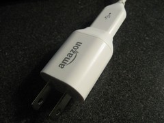
USB CONNECTION/POWER CORD :)
UpdatedI had a rant in here about how Amazon used a @#$%# proprietary cable…and then I discovered I was wrong and that those kids today have invented a new thing called a Micro-USB, which is a slimmer, squashed port I hadn’t seen before. Apparently it’s big with the skinny phones and PDAs and, well, eBook readers.
So I’ve taken back the frowny face I originally posted for this and have replaced it with a smiley face because:
The cable combines a USB socket and a sleek little plug that doesn’t take up more than one slot (you know the way they can). Apparently it’s a universal plug, so it manages the power in different countries too. All in this little package. It’s very neat.


LACK OF COVER :(
It’s sleek and slim and light. And doesn’t come with a cover. I understand that the nice leather one is $30, but some kind of slip (felt? Nylon? Something?) would have been nice. I feel scared carrying this thing around the house with me, never mind anywhere else! The Kindle 1 came with a really nice leather case. The thing slipped out of it all the time but still…I should have a cover by tomorrow.
THE BUTTONS :D
Universally panned in the first edition, the buttons were too easy to accidentally nudge. No more! And it’s not just a matter of making them smaller. The designers have done quite an ingenious thing, that is going to take my old Kindle-1-trained fingers a few pages to adjust to. The smart thing is where they have placed the hinge-point, if I can call it that. In the Kindle 1, the buttons hinged at the inside of the device, so the outside edge of the button was most sensitive. Good for easy page turning. Also good for accidental and frustrating page turning every time you looked at the d*mned thing the wrong way. The Kindle 2’s buttons are hinged at the outside: the outside edge of the buttons is almost completely unresponsive, and you have to touch closer to the inside of the button, to turn a page. I understand why they tried the original design, but this works much, much better.
SCREEN :|
The screen looks marginally narrower but that’s OK, since reading narrow columns is my preference anyway and it’s not too narrow. The text is still fine.
eINK REFRESH :)
They said the refresh rate was faster and it is. It is still something you could hate if you had a mind to, but paging through docs will take less time. You can see a grainy version of me turning pages here.
THE TEXT :D
As someone who has worked in publishing and shared a very small room with an opinionated graphic designer (is there any other kind?), my sensibilities were a bit offended by the spacing and leading in the display on Kindle 1. There seemed to be too much space in between letters and between lines. I’m no expert but there was something just a tiny bit off about the formatting that made it look a little less than book-like. I got over it really quickly and stopped seeing it. I am, however, happy to see that they seem to have changed the formatting for Kindle 2. it definitely looks more book-like.
The text is noticeably sharper than ever, although the background looks slightly darker than before.
WIRELESS :|
The wireless is automatically set to ‘on’ when you receive the Kindle and, instead of being a hardware switch, is an option within the software if you want to switch it off.
FIVE-WAY NAVIGATION NUBBIN :)
Hmm, I liked the scrolly wheel but the five-way nubbin seems to have added functionality. Now you can scroll up to a line and then across the line to a word you want. Previously, to highlight a section you had to do it by whole lines. Now I can higlight more relevant sections or single words. Nice addition.
NEW SHAPE :|
I liked the crazy old pointy shape, I’ll be honest. This one is sleeker and colder (with its brushed steel back) but lighter and easier to hold (thanks to the new buttons). Because it is taller, it’s center of gravity is different. I find it a little trickier to use the navigation system (in this case: the nubbin) one-handed, but it’s possible I’ll adjust. And yes, lefties are still going to be able to gripe that the world is right-centric because the nagivation nubbin is on the right.
NEW KEYBOARD :|
I’ll be honest, I liked the split keyboard, because it was easier to see what letters I was going for, but the new keyboard is fine. They’ve done away with the “@” key, which I had liked, and maybe I’m a little too attached to my commas, because I really wonder why that’s still hidden under the ‘symbol’ menu, but that’s just me. it’s as easy to use as these things ever are, I suspect.
POWER BUTTON :|
The power button is now no longer a fixed slider, but one of those ‘slide me and I’ll spring back’ kind of buttons. A quick slide puts the Kindle to sleep, or wakes it up. Hold the button to the side for four seconds and the Kindle turns off.
TEXT TO SPEECH :)
Once again the publishing industry has done a Shoot-First-Ask-Questions-Later act on this one. (In case you’ve missed it, they’ve started waving lawyers around at the prospect of this thing violating the audio book rights.).
Believe me, they have nothing to fear.
This is a nice feature, but it is read by a robo-voice and there is no way anyone is going to use this for more than a ‘oo, I have to make dinner now but I want to keep reading my dry non-fiction title at the same time’ kind of thing. OK, one day the robo-voice technology might be able to replace talented actors, but we’re a long way from there and I think the Author’s Guild and the lawyers need to chill.
This is a nice feature, kind of fun, kind of silly, kind of useful.
IN SHORT :D
All my happy faces relate to stuff that Make It Easy To Read, and my frowns are for The Small Stuff. They’ve made it easy to use, and it should fulfill it’s design specs of ‘getting out of the way, and letting you read books’. Like many others, I’d argue this is Kindle 1.2 rather than Kindle 2.0 but I think there are going to be lots of things about it that really grow on me. Watch this space.

It looks very good! … It is the rounder one then, yes?
Oh, and by the way, I may have told you that ”Thud!” was my favourite of the ”Watch” Discworld books… If I did I did not know what I was thinking! Hands down my favourite is ”Night Watch”!
Gotta love time travel!